
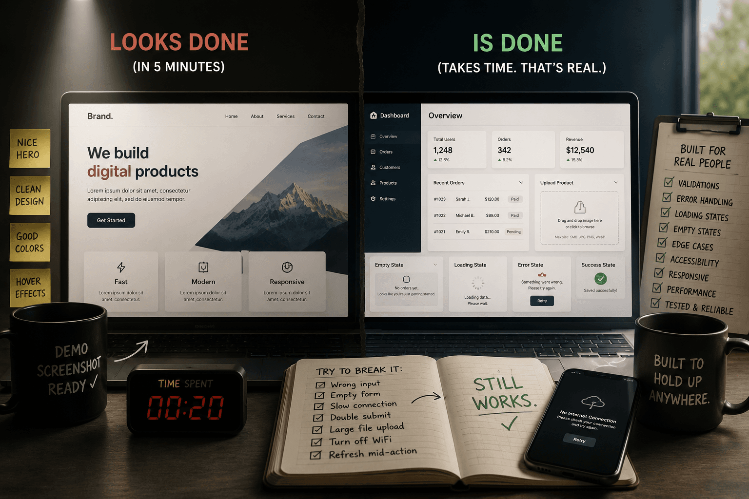
I can make almost any website look finished in about twenty minutes. Nice hero section, a few cards, a color palette that doesn't clash, some hover states. Screenshot it, and it looks like a real product. That's not a skill - that's just knowing how to arrange things that look good in a static image.
The actual work - the part that takes weeks instead of minutes - is almost entirely invisible in a screenshot. And I think that invisibility is exactly why so many websites ship looking done when they aren't.
What happens when someone types the wrong thing
Take a form. Any form - a contact form, a signup, a booking request. Making it look right takes ten minutes: label, input, button, done.
Making it actually done means deciding what happens when someone types an email with no @ symbol. What the error message says, and whether it's specific ("this needs an @ symbol") or generic and useless ("invalid input"). What happens if they submit twice by clicking fast. What the button looks like while it's submitting, so nobody clicks it four more times wondering if it worked. What happens if the request times out. Whether the person gets any confirmation at all, or just silence.
None of that shows up in a screenshot. All of it shows up the moment a real person with a real slow connection and real fat fingers actually uses the thing.
The states nobody designs for
Every piece of UI has at least four states most demos never show: empty, loading, error, and success. A product page with three items in stock looks great. The same page with zero items - does it say "out of stock" cleanly, or does it just show a blank space where a button used to be?
A dashboard with sample data looks impressive. The same dashboard on someone's very first day, before they've added anything - is there a friendly empty state guiding them toward their first action, or a stark, confusing blank screen that makes the product look broken?
I've caught myself skipping this more than once, early in a build. It's genuinely tempting to keep building forward-motion features instead of going back to ask, "what does this look like when nothing has happened yet." But that empty-state moment is often someone's actual first impression of the product - not the polished demo screenshot, the real thing, on a real bad day.
Things breaking quietly instead of loudly
The scariest bugs aren't the ones that crash the page. Those get noticed and fixed fast. The dangerous ones are the quiet failures - a form that appears to submit successfully but silently drops a field, a payment that goes through but doesn't trigger the confirmation email, an image upload that fails on files over 5MB with zero indication why.
Building something that's actually done means spending real time trying to break it on purpose. Uploading the wrong file type. Submitting with a slow, throttled connection. Testing what a screen reader actually announces, not just what it looks like visually. Most of this work produces exactly zero visible change to how the product looks in a screenshot - it just makes the thing survive contact with a real, messy, unpredictable user.
Why this matters more than it seems
None of this is about being a perfectionist for its own sake. It's about the gap between what a demo proves and what a real product needs to survive. A demo just has to work once, in front of you, on your machine, with your test data. A real product has to keep working for a stranger, six months from now, on a phone with 8% battery and bad signal, typing something you never anticipated.
That gap is where most of the actual engineering time goes on every project I build - not the part that shows up in a before/after screenshot, but the part that decides whether the thing holds up once real people start using it in ways nobody planned for.
If you're evaluating whether a website or app is actually finished, the screenshot won't tell you. Try to break it instead. Type something weird into a form. Submit with nothing filled in. Turn off your Wi-Fi mid-action and see what happens. The things that survive that kind of poking are the ones that were actually built to be done - not just built to look done.