
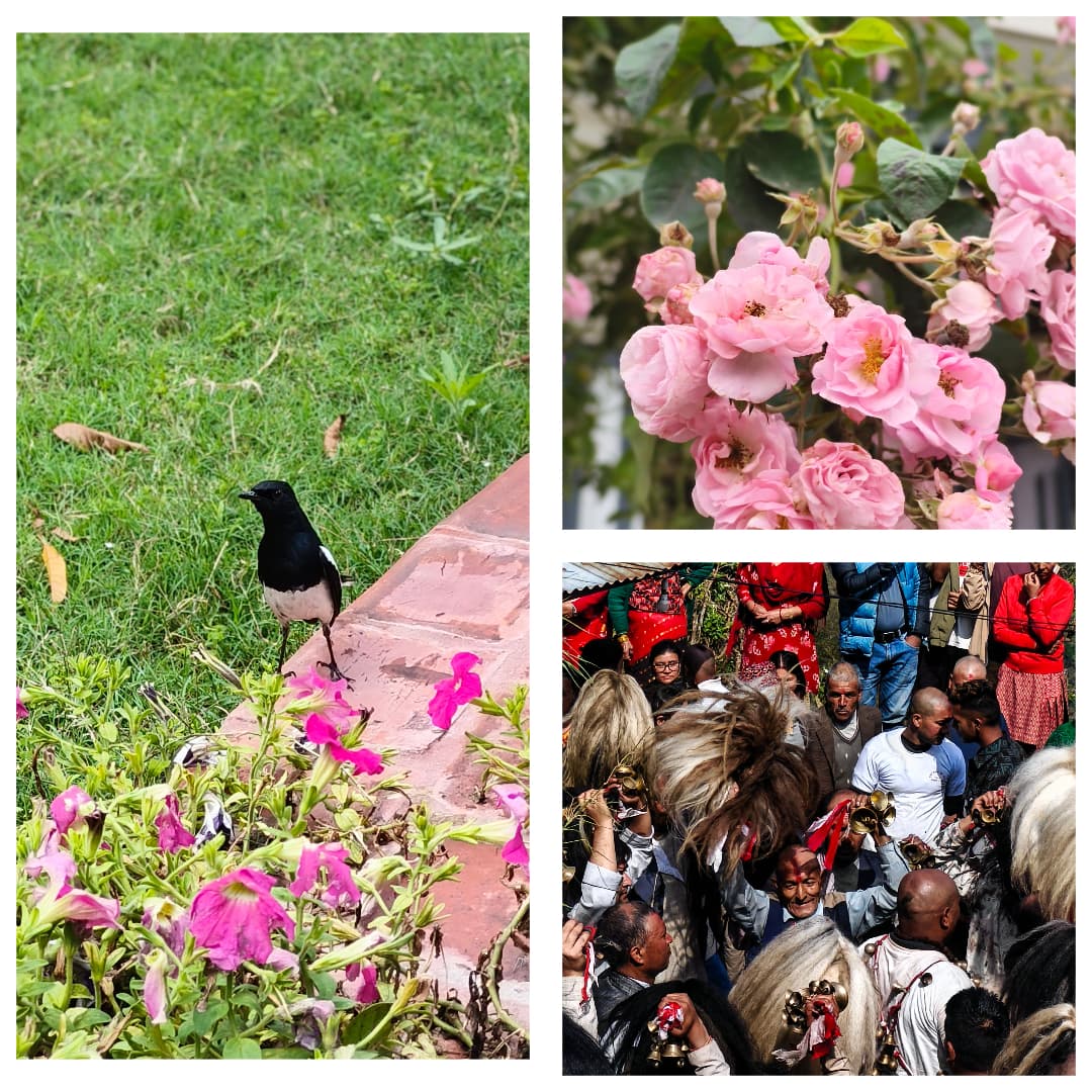
I take photos on my phone the way most people probably do - no plan, no gear beyond what's already in my pocket, just an instinct to capture something before it's gone. It's never been about an audience. I don't post most of them anywhere. It's closer to keeping a memory in a format sturdier than my own recollection of it.
I wasn't expecting it to teach me anything about my actual job. But looking back through a few of these recently, I noticed something - I kept making the same three decisions in photos that I make constantly in interface design, without ever connecting the two until now.
Negative space isn't empty, it's doing work
There's a photo I took of a single small structure against a huge stretch of open sky - mostly nothing in the frame except that one building and a lot of air around it. My first instinct when I took it was almost to zoom in, get closer, fill more of the frame with the actual subject.
I didn't, and the empty space is exactly what makes the photo work. Without all that surrounding nothing, the building would just be a building. With it, there's a sense of scale, of isolation, of the subject actually mattering because everything around it makes room for it to matter.
I catch myself relearning this constantly in interfaces. The instinct to fill a page with more content, more sections, more things happening, is strong - especially when a blank area on a screen feels like wasted opportunity. But space around an element is doing real work. It's telling the eye what to actually look at instead of asking it to figure that out alone in a crowded frame.
The thing you don't include matters as much as the thing you do
Another photo - steam rising off something on a stove, shot close, most of the actual kitchen cropped completely out of frame. If I'd stepped back and gotten the whole kitchen in the shot, it would've been a photo of a kitchen. Cropped in tight on just the steam and a bit of surface, it becomes a photo about a moment, not a room.
Framing is as much about exclusion as inclusion. What you leave outside the frame directs attention just as much as what you put inside it. In interface work, this is the entire argument for restraint - every element you choose not to put on a screen is quietly doing the same work as the ones you keep. A page with fewer, more deliberate elements reads faster and feels more considered than one where everything technically deserved to be there.
Light decides mood before content does
There's a photo of a street corner, late afternoon, long shadows cutting across it at an angle. Nothing dramatic happens in that photo - no people, no event - but it feels a specific way before you even register what's in it. That's entirely the light. Flat midday light on the same corner would've been a completely forgettable photo of pavement.
This is the one that maps most directly onto design work. Color and lighting decisions in an interface set the emotional register before a single word of copy gets read. A dark, high-contrast palette says something different than a soft, pastel one, independent of the actual content sitting on top of it. I think about this consciously now in a way I didn't before - the palette isn't neutral packaging around the content; it's doing real communicative work on its own.
I didn't set out to learn any of this
None of these photos were taken to prove a point about design. They were just moments I wanted to keep. But going back through them, the same instincts that made me stop and take a particular shot - where to leave space, what to leave out, how the light was hitting something - turned out to be the exact instincts I use everyday building interfaces, just running quietly in the background the whole time.
I'm still very new to photography, genuinely just starting to take it seriously rather than treating it as an accident that happens when something looks nice. But I like that it's teaching me things sideways, through a completely different medium, that I couldn't quite articulate the same way just by staring at a Figma file.